Flutter interactions that feel right.
Crafted by Ildeberto
Latest Discoveries
Ask to Discard Changes Before Leaving
Capture Smooth Digital Signatures in Flutter
Use Native Pull to Refresh on iOS and Android
Undo Snackbar in Flutter (Optimistic UI)
Dynamic Color Extraction (Spotify Style)
Interactive Gallery with Pinch & Zoom
Thinking Orbs Animation
Interactive 3D Globe with GoodMap
Expandable FAB
Easy Wave Animations with `wave`
Animate Smooth Page Indicators in Flutter
Highlight Features with Interactive In-App Tours
Generate Rich Link Previews in Flutter
Hold to Confirm
Add Custom Actions to Keyboard
No Material? Go with Forui.
Regretted it? Undo the action
Liquid Swipe Onboarding
Animated Emojis
Render Interactive Audio Waveforms in Flutter
Build Modern PIN and OTP Inputs with Pinput
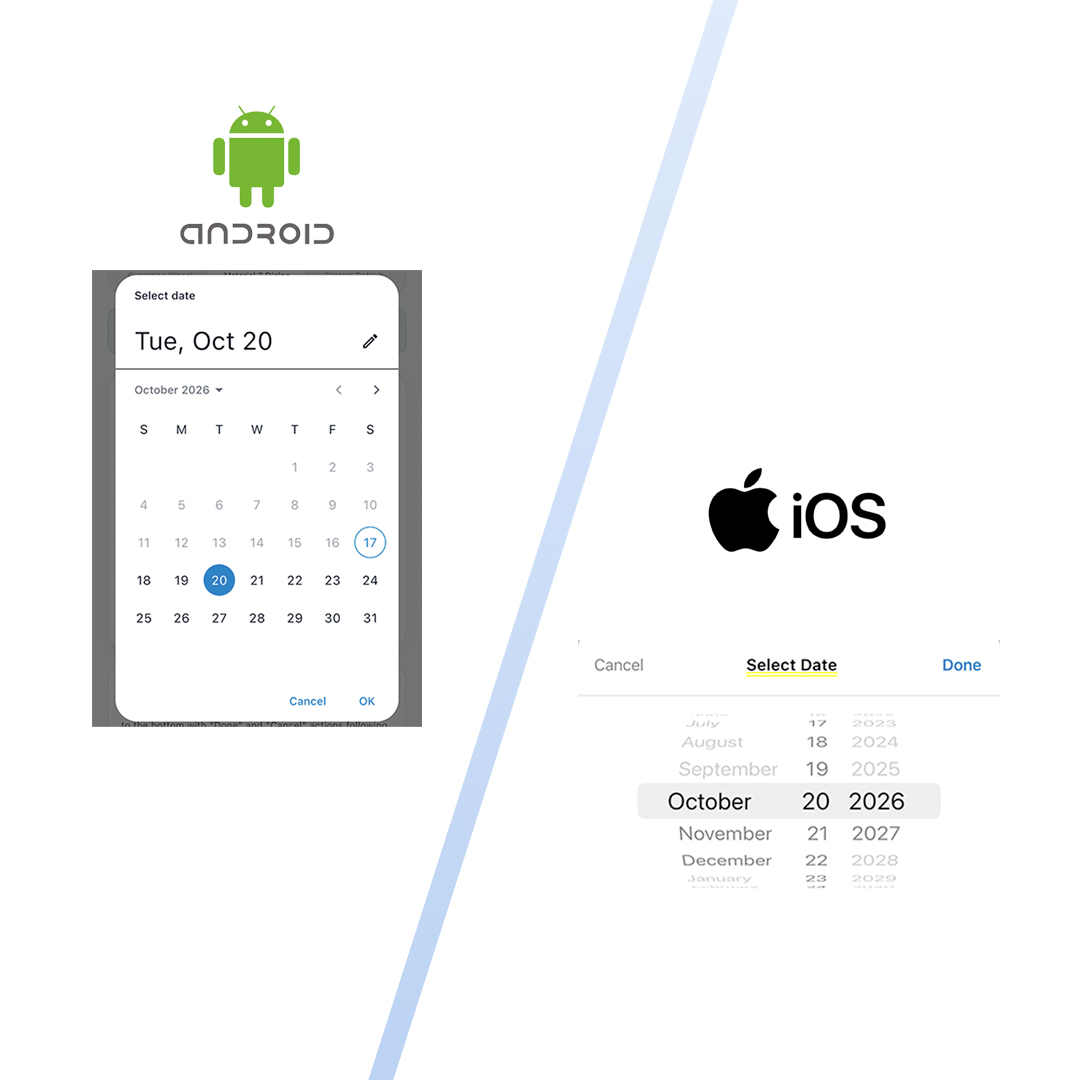
Adapt Your Date Picker to Each Platform Correctly
Auto-Blur Privacy Shield for App Switcher
Infinite 2D Gallery
Hux UI: State of the Art Design System
Swipe Actions with Dismissible
Animated Like Button
Dynamic Moving Backgrounds
Ask to Discard Changes Before Leaving 🛡️✍️
Few things destroy user trust faster than accidentally swiping back on a screen after spending 5 minutes writing a bio, drafting a post, or tweaking complex settings—only for the app to silently discard everything without warning.
Conversely, constantly popping up “Are you sure?” prompts when the user hasn’t modified anything feels annoying and clumsy.
The golden UX rule is simple:
- If clean (0 modifications): Allow instant, frictionless back navigation.
- If dirty (unsaved edits exist): Intercept the back button and gesture, prompting the user with a focused confirmation: “Discard Changes” vs. “Keep Editing”.
How it works with Flutter’s Modern PopScope
In older Flutter tutorials, developers relied on WillPopScope, which has been completely deprecated in modern Flutter. Today, the standard is PopScope:
PopScope(
  canPop: !hasUnsavedChanges,
  onPopInvokedWithResult: (bool didPop, dynamic result) async {
    // If canPop was true, the system already handled popping
    if (didPop) return;

    // Otherwise, the exit was intercepted! Show the confirmation dialog
    final shouldDiscard = await _showDiscardConfirmationDialog();
    if (shouldDiscard && context.mounted) {
      Navigator.of(context).pop();
    }
  },
  child: Scaffold(...),
)Key Engineering Takeaways
1. Dynamic Dirty State Computation
Instead of manually flipping booleans, compare the current state of controllers and switches against their initial values:
bool get _hasUnsavedChanges {
  return _nameController.text != widget.initialName ||
         _bioController.text != widget.initialBio ||
         _isOpenToWork != widget.initialIsOpenToWork;
}Whenever text changes, the form recalculates dirty status in real time, dynamically arming or disarming the PopScope.
2. Guarding the Custom Back Button
Remember to call Navigator.maybePop(context) instead of Navigator.pop(context) in your custom AppBar back button. maybePop respects the active PopScope, triggering the same confirmation logic as the native Android hardware back button and the iOS interactive swipe gesture!
Animate Smooth Page Indicators in Flutter ⚪🔵⚪
Static dots or generic tab bars make mobile walkthroughs and carousels feel rigid. In modern apps (like Apple Arcade, Airbnb, or Duolingo), page indicators feel fluid: dots stretch, expand, crawl, or jump smoothly as the user drags their finger across the screen.
In Flutter, the gold standard for animated page indicators is the smooth_page_indicator package.
Package Installation
Add the package to your pubspec.yaml:
dependencies:
smooth_page_indicator: ^3.0.0Direct link to pub.dev: smooth_page_indicator on pub.dev
How It Works Under the Hood
The magic of SmoothPageIndicator is that it takes a standard Flutter PageController.
Instead of listening only to discrete page indices (0, 1, 2), it listens to the continuous scroll offset stream (0.0 -> 0.45 -> 1.0). As the user’s thumb moves across the screen, the dots morph in direct 60/120 FPS physical lockstep.
SmoothPageIndicator(
  controller: _pageController, // Listens to scroll offset
  count: 4,                    // Number of pages
  effect: ExpandingDotsEffect(
    activeDotColor: Colors.blueAccent,
    dotColor: Colors.grey.shade300,
    dotHeight: 9,
    dotWidth: 9,
    expansionFactor: 3.5,
  ),
  onDotClicked: (index) {
    _pageController.animateToPage(
      index,
      duration: const Duration(milliseconds: 350),
      curve: Curves.easeInOut,
    );
  },
)Popular Built-in Effects
The library comes with several pre-built physics effects:
ExpandingDotsEffect: The active dot smoothly stretches horizontally as you scroll into it (the modern standard in iOS & Threads).WormEffect: The dot stretches like an inchworm to bridge the gap between pages.JumpingDotEffect: The active dot hops over adjacent dots with bouncy physics.SwapEffect: The active dot trades places with neighboring dots.
Interactive Tap Navigation
By supplying the onDotClicked callback, users can tap directly on any dot to smoothly animate the carousel forward or backward!
Render Interactive Audio Waveforms in Flutter 🎵🌊
When developing in simulators (iOS Simulator or Android Emulator), microphone recording hardware is often restricted or unavailable. In these environments, loading and playing a sample audio track (such as an MP3 file) with real extracted waveforms provides an immediate, interactive way to test waveform visualization.
The audio_waveforms package enables extracting amplitude waveforms from audio files and provides interactive touch scrubbing.
Package Installation
Add the dependency to your pubspec.yaml:
dependencies:
audio_waveforms: ^2.0.2Direct link to pub.dev: audio_waveforms on pub.dev
Setting Up Sample Audio
Because audio_waveforms requires a local file path to extract amplitude data, you can copy an audio file (from assets or download) to the temporary directory:
final File localFile = File('${Directory.systemTemp.path}/sample_sound.mp3');

if (!localFile.existsSync()) {
  // Load sample audio from bundled assets or network
  final byteData = await rootBundle.load('assets/audio/sample.mp3');
  await localFile.writeAsBytes(byteData.buffer.asUint8List());
}Preparing the Player & Extracting Waveforms
Initialize PlayerController and prepare the audio file. Passing shouldExtractWaveform: true automatically extracts waveform amplitudes:
final PlayerController _playerController = PlayerController();

await _playerController.preparePlayer(
  path: localFile.path,
  shouldExtractWaveform: true,
  noOfSamples: 60, // Total number of waveform bars
);

// Listen to playback duration and player state
_playerController.onCurrentDurationChanged.listen((currentMs) {
  print('Current playback position: $currentMs ms');
});

_playerController.onPlayerStateChanged.listen((state) {
  print('Player state: $state');
});Displaying the Waveform Widget
Use AudioFileWaveforms to display the waveform with interactive scrubbing:
AudioFileWaveforms(
  size: Size(MediaQuery.of(context).size.width - 96, 70),
  playerController: _playerController,
  waveformType: WaveformType.fitWidth,
  enableSeekGesture: true,
  playerWaveStyle: const PlayerWaveStyle(
    fixedWaveColor: Color(0xFFD1D5DB), // Unplayed bars
    liveWaveColor: Color(0xFF111827),  // Played bars
    spacing: 6,
    waveThickness: 3.0,
    backgroundColor: Colors.transparent,
    showSeekLine: true,
    seekLineColor: Color(0xFFEA4335),
    seekLineThickness: 2.0,
  ),
)Playback Controls
// Start playback
await _playerController.startPlayer();

// Pause playback
await _playerController.pausePlayer();

// Seek to a specific position (in milliseconds)
await _playerController.seekTo(15000); // 15 secondsCleanup
Always dispose the controller when leaving the screen:
@override
void dispose() {
  _playerController.dispose();
  super.dispose();
}Capture Smooth Digital Signatures in Flutter ✍️
A clean and simple signature pad demonstration using the signature package in Flutter.
Package Installation
Add the dependency to your pubspec.yaml:
dependencies:
signature: ^6.4.0Direct link to pub.dev: signature on pub.dev
Minimal Setup
1. Controller
Create a SignatureController with stroke width and pen color:
final SignatureController _controller = SignatureController(
  penStrokeWidth: 3,
  penColor: const Color(0xFF111827),
  strokeCap: StrokeCap.round,
  strokeJoin: StrokeJoin.round,
  exportBackgroundColor: Colors.transparent,
);

@override
void dispose() {
  _controller.dispose();
  super.dispose();
}2. Canvas Widget
Place the Signature widget inside a rounded container:
Container(
  height: 220,
  decoration: BoxDecoration(
    color: Colors.white,
    borderRadius: BorderRadius.circular(16),
    border: Border.all(color: const Color(0xFFE5E7EB)),
  ),
  child: Signature(
    controller: _controller,
    backgroundColor: Colors.white,
  ),
)3. Actions (Undo, Clear, Export)
// Undo last stroke
_controller.undo();

// Clear pad
_controller.clear();

// Export as PNG bytes
final Uint8List? data = await _controller.toPngBytes();Highlight Features with Interactive In-App Tours 💬🔦
When users open a messaging app or chat screen for the first time, static help screens or lengthy modal sheets are often dismissed without being read.
The most effective, modern onboarding pattern (seen in apps like Telegram, Slack, and Gmail) is the Focused Spotlight Guided Tour. The background screen dims gracefully, spotlighting core elements one at a time with a minimal, contextual tooltip.
In Flutter, the industry standard package for building in-app tours is showcaseview.
Package Installation
Add the latest verified version to your pubspec.yaml:
dependencies:
showcaseview: ^5.1.0Direct link to pub.dev: showcaseview on pub.dev
The 3 Pillars of ShowcaseView (v5+)
1. Registering the Showcase Scope
In showcaseview v5+, register the showcase controller in your screen’s initState and unregister it on dispose:
@override
void initState() {
  super.initState();
  // Register the showcase view controller
  ShowcaseView.register();

  WidgetsBinding.instance.addPostFrameCallback((_) {
    _startGuidedTour();
  });
}

@override
void dispose() {
  ShowcaseView.get().unregister();
  super.dispose();
}2. Attaching GlobalKeys to Target UI Elements
Each widget you want to spotlight requires its own GlobalKey so ShowcaseView can calculate its exact on-screen geometry. In this minimalist chat layout, we spotlight only the top action bar elements:
final GlobalKey _keyContact = GlobalKey();
final GlobalKey _keyPinned = GlobalKey();
final GlobalKey _keyPrivacy = GlobalKey();Wrap each target element with a Showcase widget:
// 1. Contact Profile
Showcase(
  key: _keyContact,
  title: 'Contact Profile',
  description: 'Tap on the contact to view shared photos, media links, and privacy settings.',
  tooltipBackgroundColor: const Color(0xFF202124),
  textColor: Colors.white,
  child: ContactHeader(),
)

// 2. Pinned Announcement Bar
Showcase(
  key: _keyPinned,
  title: 'Pinned Messages',
  description: 'Important conversation notes stay pinned right here at the top.',
  tooltipBackgroundColor: const Color(0xFF202124),
  textColor: Colors.white,
  child: PinnedBar(),
)

// 3. Disappearing Messages Action
Showcase(
  key: _keyPrivacy,
  title: 'Expiring Messages',
  description: 'Set messages to automatically disappear after 24 hours for enhanced privacy.',
  tooltipBackgroundColor: const Color(0xFF202124),
  textColor: Colors.white,
  child: IconButton(
    icon: const Icon(Icons.timer_outlined),
    onPressed: () {},
  ),
)3. Launching the Guided Tour Sequence
Trigger the walkthrough sequence with ShowcaseView.get().startShowCase(...):
void _startGuidedTour() {
  HapticFeedback.mediumImpact();
  ShowcaseView.get().startShowCase([
    _keyContact,
    _keyPinned,
    _keyPrivacy,
  ]);
}By focusing exclusively on the top header and navigation items, the user gets oriented quickly without cluttering the bottom input and composer controls.
Build Modern PIN and OTP Inputs with Pinput 🔢🔐
Building custom segmented PIN/OTP input boxes from scratch using multiple individual TextFields is a notorious Flutter headache: handling focus transitions, backspaces, clipboard pasting, and custom box decorations quickly spirals into hundreds of lines of brittle code.
The Flutter community standard for OTP, 2FA, and SMS verification is pinput.
Package Installation
Add the package to your pubspec.yaml:
dependencies:
pinput: ^6.0.2Direct link to pub.dev: pinput on pub.dev
The Power of PinTheme
Pinput uses the PinTheme class to style individual input boxes across all their lifecycle states:
final defaultPinTheme = PinTheme(
  width: 48,
  height: 54,
  textStyle: const TextStyle(fontSize: 20, fontWeight: FontWeight.bold),
  decoration: BoxDecoration(
    color: Colors.white,
    borderRadius: BorderRadius.circular(12),
    border: Border.all(color: Colors.grey.shade300, width: 1.5),
  ),
);

// Derive focused theme using copyWith
final focusedPinTheme = defaultPinTheme.copyWith(
  decoration: defaultPinTheme.decoration?.copyWith(
    border: Border.all(color: Colors.blueAccent, width: 2),
  ),
);Core Features Implemented in this Tutorial
-
Four Visual States:
defaultPinTheme: Resting state with clean borders.focusedPinTheme: Active state highlighted with brand color and soft shadow.submittedPinTheme: Filled state confirming entered digits.errorPinTheme: Vibrant error red border with instant shake/feedback.
-
Obscure Mode (Password Dots):
- Toggle
obscureText: trueto mask digits as privacy dots (••••••) for banking and passcode screens.
- Toggle
-
Auto-Submit on Completion:
- The
onCompleted: (pin) => ...callback fires automatically as soon as the 6th digit is typed, eliminating the need for a separate submit button.
- The
-
Haptic Verification Feedback:
- Triggers
HapticFeedback.heavyImpact()on successful verification andHapticFeedback.vibrate()on error.
- Triggers
Use Native Pull to Refresh on iOS and Android 🔄
Sometimes simplicity is the highest form of sophistication. You don’t always need complex physics or custom particle effects—users already understand and love the native pull-to-refresh interaction of their phone.
In Flutter, you can achieve a 100% native feel on both iOS and Android using RefreshIndicator.adaptive.
Why RefreshIndicator.adaptive?
Flutter provides RefreshIndicator, which by default renders the Android Material spinner.
By using the .adaptive constructor:
- On iOS: It automatically renders the native Apple Cupertino activity indicator.
- On Android: It renders the Material 3 circular progress indicator.
RefreshIndicator.adaptive(
  onRefresh: _handleRefresh,
  color: const Color(0xFF18181B), // Indicator color
  backgroundColor: Colors.white,
  child: ListView.separated(
    physics: const AlwaysScrollableScrollPhysics(),
    itemCount: items.length,
    separatorBuilder: (_, __) => const Divider(),
    itemBuilder: (context, index) => ListTile(title: Text(items[index])),
  ),
)Two Critical Details
1. The AlwaysScrollableScrollPhysics
If your list only has 2 or 3 items, Flutter may disable scrolling because the content fits within the screen height. Without scrolling, pull-to-refresh will not trigger!
Always set:
physics: const AlwaysScrollableScrollPhysics()This forces the list to accept pull gestures even when the item count is small.
2. Returning a Future
The onRefresh callback must return a Future<void>. The indicator stays active until the returned Future completes:
Future<void> _handleRefresh() async {
  final newArticles = await api.fetchLatestArticles();
  setState(() {
    items.insertAll(0, newArticles);
  });
}Generate Rich Link Previews in Flutter 🔗✨
When users share links in modern apps like Telegram, WhatsApp, Slack, or Twitter/X, they don’t just see a plain blue string (https://...). Instead, the app extracts the URL and renders an eye-catching Rich Link Preview Card complete with an OpenGraph thumbnail, page title, site domain, and summary description.
In Flutter, we implement this using the actively maintained flutter_link_previewer package (part of the Flyer Chat ecosystem).
Package Installation
Add the verified latest versions to your pubspec.yaml:
dependencies:
  flutter_link_previewer: ^4.2.1
flutter_chat_core: ^2.9.1Direct link to pub.dev: flutter_link_previewer on pub.dev
How It Works
When a text or URL is supplied to LinkPreview:
- It automatically extracts and parses any URL embedded inside natural text strings.
- It sends an HTTP GET request to the target web page, reads the HTML
<head>tags, and extracts:- Open Graph Tags:
<meta property="og:title">,og:image,og:description. - Twitter Cards:
<meta name="twitter:title">,twitter:image. - Standard HTML fallback tags.
- Open Graph Tags:
- It fires the
onLinkPreviewDataFetchedcallback with the extractedLinkPreviewData.
1. Caching Metadata to Prevent Refetching
Re-fetching metadata on every widget rebuild wastes mobile data and drains the battery. Store the fetched LinkPreviewData in your message model or widget state:
import 'package:flutter_link_previewer/flutter_link_previewer.dart' hide Size;

LinkPreview(
  // The raw message text containing the URL
  text: message.text,

  // Cached metadata object
  linkPreviewData: message.previewData,

  // Callback to store parsed data in state
  onLinkPreviewDataFetched: (data) {
    setState(() {
      message.previewData = data;
    });
  },

  // Visual styling
  borderRadius: 12,
  sideBorderColor: const Color(0xFF2563EB),
  sideBorderWidth: 3,
  insidePadding: const EdgeInsets.all(12),
  titleTextStyle: const TextStyle(
    fontSize: 13,
    fontWeight: FontWeight.w700,
  ),
  descriptionTextStyle: const TextStyle(
    fontSize: 11,
    color: Colors.grey,
  ),
)2. Real-Time Composer Detection & Dismissibility
In our tutorial implementation:
- As the user types in the message field, a regex listener identifies incoming URLs.
- A floating preview card pops up above the input bar with an
'X'button, giving users the freedom to dismiss the card if they only want to send the raw link.
Adapt Your Date Picker to Each Platform Correctly 🍎🤖
One of the quickest ways a cross-platform app betrays itself as “cheap” or “un-native” is forcing an Android Material Design calendar pop-up onto an iOS user, or vice versa.
- iOS users expect a smooth spinning wheel picker (
CupertinoDatePicker) anchored in a bottom action sheet with a tactile toolbar containing “Cancel” and “Done”, conforming to Apple’s Human Interface Guidelines (HIG). - Android users expect a centered Material 3 dialog with month grids, year selectors, and standard elevation.
With Flutter, you don’t need external packages to deliver this native fidelity. Both engines are built directly into the framework!
The Adaptive Architecture
Detect the target platform using Theme.of(context).platform:
bool get isIos =>
    Theme.of(context).platform == TargetPlatform.iOS ||
    Theme.of(context).platform == TargetPlatform.macOS;

Future<void> pickDate(BuildContext context) async {
  if (isIos) {
    await showCupertinoDatePicker(context);
  } else {
    await showMaterialDatePicker(context);
  }
}1. The iOS Cupertino Bottom Sheet
Use showCupertinoModalPopup with a CupertinoDatePicker wrapped inside a SafeArea and an action toolbar:
showCupertinoModalPopup<void>(
  context: context,
  builder: (modalContext) {
    return Container(
      height: 310,
      decoration: const BoxDecoration(
        color: CupertinoColors.systemBackground,
        borderRadius: BorderRadius.vertical(top: Radius.circular(20)),
      ),
      child: Column(
        children: [
          // Toolbar with Cancel and Done
          CupertinoToolbar(onDone: () => Navigator.pop(modalContext)),
          Expanded(
            child: CupertinoDatePicker(
              mode: CupertinoDatePickerMode.date,
              initialDateTime: selectedDate,
              onDateTimeChanged: (newDate) => tempDate = newDate,
            ),
          ),
        ],
      ),
    );
  },
);2. The Android Material 3 Dialog
Use Flutter’s standard showDatePicker:
final picked = await showDatePicker(
  context: context,
  initialDate: selectedDate,
  firstDate: DateTime.now(),
  lastDate: DateTime.now().add(const Duration(days: 365)),
);By abstracting date picking behind a single unified function, your business logic remains completely untouched while every user enjoys a familiar, native operating system experience.
Undo vs Confirm ⏪
Interrupting the user’s workflow with an “Are you sure you want to delete this?” dialog is a relic of old desktop software. The modern standard (popularized by Gmail) is Optimistic UI with Undo.
When the user taps delete, we assume they mean it. The item instantly vanishes from the screen, making the app feel lightning fast. However, we immediately slide in a SnackBar offering them a window of forgiveness: the “Undo” button.
How it works in Flutter
We implement this premium UX using two native Flutter tools:
AnimatedList: Instead of a regular ListView, we use an AnimatedList. When we callremoveItem, the item gracefully slides and fades away.ScaffoldMessenger: We immediately summon a SnackBar with anactionbutton.
If the user taps Undo, we simply insert the data back into the list array and call insertItem on the AnimatedList key. It slides right back into place!
Backend Strategy
In a real production app, how do you handle the API call? You have two choices:
- The Delayed Request: Wait 4 seconds (the duration of the SnackBar). If they don’t tap Undo, then send the HTTP DELETE request to the server.
- The Instant Request: Send the DELETE request instantly. If they tap Undo, send a new HTTP POST request to re-create or restore the item on the server.
Hold to Confirm ⏱️
For decades, software has relied on the infamous “Are you sure?” dialog box to prevent users from accidentally deleting data. The problem? Users have developed muscle memory and blindly click “Yes” on pop-ups without reading them.
Modern apps (like banking apps, server dashboards, and game inventories) have replaced these pop-ups with Hold-to-Confirm buttons. It physically forces the user to pause, hold their finger down, and watch a progress bar fill up. It is impossible to do by accident.
How it works in Flutter
We don’t need any external packages. We build this using three core Flutter concepts:
AnimationController: We create a controller with a duration of 1.5 seconds.Listener: We wrap our button in aListenerto detect raw touch events.onPointerDown: We call_controller.forward()to start filling the bar.onPointerUp: If the user lets go early, we call_controller.reverse()so the bar shrinks back down.
FractionallySizedBox: We use this inside aStackto draw the filling background color based on_controller.value.
Haptic Feedback (Physical UX)
To make it feel like a real, heavy physical button, we use HapticFeedback:
HapticFeedback.lightImpact()when the user starts holding.HapticFeedback.heavyImpact()when the animation reaches 100% and the action is irreversibly executed.
Try letting go before the bar fills up to see the cancellation animation!
Biometric Privacy Shield 🛡️
When building banking, crypto, or messaging apps, security is paramount. A common leak of private data happens when the user swipes up to enter the OS Multitasking/App Switcher. The OS takes a “screenshot” of the app to display in the thumbnail, potentially exposing account balances or private messages to anyone looking over the user’s shoulder.
In this tutorial, we fix this by injecting a frosted glass blur the millisecond the app goes into the background.
The Secret: WidgetsBindingObserver
We don’t need any external packages to achieve this. Flutter provides a native way to listen to OS lifecycle events through the WidgetsBindingObserver mixin.
By observing the didChangeAppLifecycleState, we can detect exactly when the OS triggers the inactive or paused state.
AppLifecycleState.inactive: The app is still visible but cannot receive input (e.g. the user just started swiping up to enter the App Switcher on iOS).AppLifecycleState.paused: The app is fully in the background.
The Implementation
When the state changes to inactive, we instantly set a boolean _isBackgrounded to true.
In our build method, we wrap the entire screen in a Stack. If _isBackgrounded is true, we render a Positioned.fill overlay with a BackdropFilter set to ImageFilter.blur(sigmaX: 15, sigmaY: 15).
This guarantees that the OS screenshot taken for the app switcher will only capture the beautiful, frosted privacy shield!
Adaptive Design with Dynamic Colors 🎨
One of the most luxurious details of modern music apps (like Apple Music and Spotify) is how the entire interface morphs to embrace the album art you are listening to. The background, the gradients, and even the play buttons magically change color to match.
In this tutorial, we replicate this premium architecture by building a reactive Album View using the palette_generator_plus package.
Why “Plus”?
The original Google package (palette_generator) has been discontinued. We updated our architecture to use the modern, community-maintained successor, palette_generator_plus, which features optimized performance (Isolates) and color extraction perfectly tuned for Material 3.
The Extraction Flow
The magic happens in 3 simple steps inside our _extractColors() function:
- Loading: We create a
NetworkImagepointing to our album cover (a high-quality neon image from Unsplash). - Analytical Clustering: We pass this image to
PaletteGenerator.fromImageProvider. The package scans the pixels and clusters the colors, returning a Palette. - Color Injection: We grab the strongest, most vibrant color using
paletteGenerator.dominantColor?.color.
UX Bonus (Accessibility)
What if the extracted color is a very light white, causing our text to become unreadable? The paletteGenerator handles the mathematical accessibility for us! We simply read the titleTextColor property it provides to guarantee our track title has perfect, readable contrast against the dynamically generated background gradient.
All of this is wrapped inside an AnimatedContainer and an AnimatedDefaultTextStyle, making the UI transition like silk the moment the image finishes loading.
Native Keyboard Mastery ⌨️
One of the biggest differentiators of premium apps is how they handle typing interactions. Relying on the standard OS keyboard covers the basics, but elite developers inject custom logic directly into the keyboard space.
Using the latest version of the keyboard_actions package (v5+), we didn’t just solve the classic iOS problem (the missing “Done” button on numeric keypads), we went further by building Quick Actions.
What We Built
By wrapping the screen in the KeyboardActions widget, we inject an overlay perfectly aligned above the system keyboard:
-
Numeric Field (iOS Fix): We added the famous blue “Done” button to dismiss the numeric keypad (something Apple doesn’t provide natively on the iPhone numeric keyboard). We also enabled
displayArrows, allowing users to jump between inputs without tapping the screen. -
Generic Text Field (Quick Actions): Here is the magic! If the user opens the keyboard on the notes field, the overlay now displays dynamic buttons:
- A Hashtag (#) button that instantly injects the ‘#flutter’ tag into the TextEditingController’s string.
- A Mention (@) button to tag the ‘@equipa’.
- A red Clear button aligned to the far right (using a
Spacer()) to wipe all text in the blink of an eye.
This UX approach saves users dozens of taps in complex forms and note-taking apps.
Infinite 2D Gallery Engine 🗺️
Sometimes GridView and InteractiveViewer just aren’t enough when you want to build a truly unbounded canvas (like a map or an infinite photo grid) that feels completely native and handles natural scrolling momentum.
In this advanced tutorial, we build a Custom 2D Scrolling Engine from scratch, featuring a staggered honeycomb layout!
1. Natural Momentum Physics
To simulate realistic scrolling (flinging), we capture the velocity when the user lifts their finger in onScaleEnd. We then calculate a stopping distance and animate our offset using a curved animation (Curves.easeOutCubic) to mimic friction!
void _onScaleEnd(ScaleEndDetails details) {
  final velocity = details.velocity.pixelsPerSecond;
  final distance = velocity.distance * 0.15;

  if (distance > 10) {
    final direction = velocity / velocity.distance;
    final endOffset = _offset + (direction * distance);

    _animation = Tween<Offset>(begin: _offset, end: endOffset).animate(
      CurvedAnimation(parent: _controller, curve: Curves.easeOutCubic)
    );

    _controller.forward(from: 0);
  }
}2. Pinch-to-Zoom centered on the Fingers
When scaling, if we simply multiply our items by _scale, the zoom will center on the top-left of the screen. To make it zoom exactly where the user is pinching (the focal point), we apply this vector math trick:
final newScale = (_baseScale * details.scale).clamp(0.3, 3.0);
final scaleRatio = newScale / _scale;

// Keep the focal point locked by shifting the offset
_offset = details.localFocalPoint - (details.localFocalPoint - _offset) * scaleRatio;
_scale = newScale;3. The Staggered Math (Honeycomb Layout)
To make the gallery look organic rather than a rigid chess board, we shift every odd column downwards by exactly half a tile size (tileSize / 2).
// If the column index is an odd number, push the tile down by half its height
final double staggeredOffsetY = (col.abs() % 2 == 1) ? (tileSize / 2) : 0.0;

final double x = col * tileSize + _offset.dx;
final double y = row * tileSize + _offset.dy + staggeredOffsetY;4. High Performance Rendering
A truly infinite grid would crash the app if we rendered every item. Instead, we calculate exactly how many columns and rows fit on the screen based on the current scale, and only generate the Positioned widgets for the visible tiles. This makes the gallery incredibly smooth, even if it spans millions of theoretical pixels!
Interactive Image Gallery 🖼️
A common requirement for modern apps is a photo gallery where users can click an image to view it full-screen, swipe between photos, and zoom in to see details.
In the past, developers had to rely on heavy third-party packages to achieve this. But Flutter now has a powerful native widget for this exact purpose: InteractiveViewer.
In this tutorial, we combine three powerful Flutter mechanics:
- 2D Infinite Canvas: We wrap a massive 20x20 image grid inside an
InteractiveViewerwithconstrained: false, allowing the user to pan in any direction (X and Y) and zoom out to see the whole “map” of images. HeroAnimations: For the seamless transition from the 2D Canvas to Full Screen.- Double-tap to Zoom: Custom math to zoom into a specific point in full screen.
The InteractiveViewer
The InteractiveViewer widget handles multi-touch gestures out of the box.
InteractiveViewer(
  panEnabled: true,
  scaleEnabled: true,
  minScale: 1.0, // Prevent zooming out smaller than the screen
  maxScale: 4.0, // Max zoom limit
  child: Image.network(url),
)Adding “Double-Tap to Zoom”
While pinch-to-zoom is automatic, users also expect to double-tap to zoom in and out. To achieve this, we capture the tap position using GestureDetector and use a TransformationController mixed with an AnimationController to smoothly animate the matrix scale!
// 1. Capture the exact coordinate the user tapped
void _handleDoubleTapDown(TapDownDetails details) {
  _doubleTapDetails = details;
}

// 2. Animate the matrix to scale into that point
void _handleDoubleTap() {
  final position = _doubleTapDetails!.localPosition;
  final isZoomed = _transformationController.value.getMaxScaleOnAxis() > 1.0;

  final endMatrix = isZoomed
      ? Matrix4.identity()
      : Matrix4.identity()
        ..translate(-position.dx * 2, -position.dy * 2)
        ..scale(3.0);

  _animation = Matrix4Tween(
    begin: _transformationController.value,
    end: endMatrix,
  ).animate(_animationController);

  _animationController.forward(from: 0);
}This ensures your app feels exactly like a native iOS or Android photo gallery, without adding a single external dependency!
The Blank Canvas: Flutter Beyond Material 🎨
Since recent Flutter updates, the framework has increasingly distanced itself from forcing Material Design down every developer’s throat. The core architecture has been modularized, proving once and for all: Flutter is not a Google App builder, it is a pure painting canvas.
If you are tired of the default Android-like aesthetic and want a sleek, modern, web-first look (heavily inspired by the legendary shadcn/ui), Forui is your best friend.
1. Dropping the Material Dependency
Take a look at the top of your dart file. Instead of this:
import 'package:flutter/material.dart'; // ❌ We don't need this anymore!You can now strictly use the core widgets and your new design system:
import 'package:flutter/widgets.dart'; // ✅ Pure Flutter Core
import 'package:forui/forui.dart'; // ✅ Forui Design System2. The F-Widgets
Forui replaces standard Material components with F-prefixed components that follow a strict, minimalistic design language.
FScaffoldinstead ofScaffoldFButtoninstead ofElevatedButtonFTextFieldinstead ofTextField
FButton(
  onPress: () => print('Hello Forui!'),
  child: const Text('Click me'),
)3. The Power of Custom Themes
By wrapping your app in FTheme(data: FTheme.neutral.dark.touch, ...) inside a raw WidgetsApp, every single component instantly adapts to a perfectly crafted, high-contrast dark mode with beautiful rounded corners and subtle borders. No more fighting with ThemeData or unexpected semantic errors from MaterialApp!
4. More Information
To explore more about this incredible design system, check out the official links:
- Pub.dev: https://pub.dev/packages/forui
- GitHub: https://github.com/duobaseio/forui
Embrace the Blank Canvas era. Your apps are about to look much more premium.
Hux UI: The Future of Flutter Interfaces 🚀
If you’re looking for a state-of-the-art UI library that brings highly polished, animated, and consistent components to Flutter, Hux UI is exactly what you need.
Designed by the brilliant folks at LofiDesigner, Hux UI offers components that feel incredibly premium right out of the box, reducing the amount of time you spend tweaking padding, shadows, and hover states.
1. Why Hux UI?
Hux UI excels in bringing a modern and clean design language to your applications. It provides:
- Multiple variants for components out-of-the-box (e.g., primary, secondary, outline, ghost).
- Data visualization charts.
- Advanced Tab and Navigation structures.
- Beautiful dark-mode-first aesthetic.
2. Using Hux Components
Integrating Hux is straightforward. Replace standard Material components with their Hux equivalents.
// A beautifully styled button with variants
HuxButton(
  variant: HuxButtonVariant.primary,
  onPressed: () => print('Hello Hux!'),
  child: const Text('Get Started'),
)

// A clean and modern input field
HuxInput(
  hint: 'name@example.com',
)3. The Power of Cards
HuxCard is one of the most versatile components in the system, automatically applying the correct background colors, borders, and shadows to ensure your content stands out without looking cluttered.
4. More Information
To explore the entire ecosystem of Hux UI, including their live web playground, check out the official links:
- Pub.dev: https://pub.dev/packages/hux
- Website/Live Demo: https://ui.thehuxdesign.com
- GitHub: https://github.com/lofidesigner/hux
If you want your app to look like a premium tool designed by a top-tier studio, Hux UI is your toolkit.
Orb Animations with orb_animations
Building dynamic, organic status indicators (like “Siri” or ChatGPT’s voice mode) from scratch using CustomPainter and custom Shaders can be complex and prone to performance issues. Thankfully, there is an incredibly lightweight package that solves exactly this: orb_animations.
This package is perfect for loading indicators, live visual states (like “recording audio”), and expressive UI feedback.
1. Installation
Simply add the package to your pubspec.yaml:
dependencies:
orb_animations: ^1.0.0And run flutter pub get.
2. The Magic of ThinkingOrb
The main widget is called ThinkingOrb. It has no heavy external dependencies and uses a single internal Ticker to guarantee a constant 60fps (or 120fps) with minimal CPU usage.
Basic Example:
import 'package:orb_animations/orb_animations.dart';

ThinkingOrb(
  state: OrbState.working,  // The animation type
  size: OrbSize.size64,     // The preset size (64px or 20px)
  speed: 1.0,               // Speed multiplier
)3. The Available States
The best part of this package is that it comes with several hand-tuned animation states right out of the box:
OrbState.working(Processing information)OrbState.searching(Looking for something)OrbState.solving(Logically solving a problem)OrbState.listening(Listening to user audio)OrbState.composing(Generating text/response)OrbState.shaping(Drawing or morphing shapes)
Accessibility Tip ♿️
This package is incredibly detailed: if the user has the “Reduced Motion” option enabled in their phone settings (iOS or Android), ThinkingOrb automatically detects this (via MediaQuery.disableAnimations) and draws only a static, deterministic frame without animation. This natively respects user accessibility settings!
Time Travel in Flutter ⏳
“It’s like taking a snapshot of the state of something you want to remember later… The great thing is that this ‘photo’ or ‘record’ doesn’t spoil ANYTHING or interfere with what’s happening at that moment.”
The Memento Pattern is a behavioral design pattern that allows you to save and restore the state of an object without exposing its internal details.
There is no better way to demonstrate this than a Drawing Application. Imagine trying to mathematically erase a specific brush stroke that intersects with 5 other strokes. It’s a nightmare. Instead, using the Memento pattern, we just take a “snapshot” of the canvas before drawing. If the user hits undo, we replace the entire canvas with the snapshot!
The Three Pillars of Memento
The pattern requires three specific components:
- Originator: The object whose state needs to be preserved (Our Canvas Controller).
- Memento: The “snapshot” object containing the state (The list of strokes).
- Caretaker: The manager that stores the history of Mementos (Using Undo/Redo Stacks).
Modern Dart Implementation
In modern Flutter applications, the best practice is to capture the entire state into an immutable Memento using List.unmodifiable().
1. The Immutable Memento
class CanvasMemento {
  final List<DrawingStroke> strokes;

  // ⚠️ CRITICAL: We use List.unmodifiable() to create a deep copy.
  // If we just assigned the list, the Memento would point to the
  // same memory address as the Canvas, breaking the pattern!
  CanvasMemento(List<DrawingStroke> currentStrokes)
      : strokes = List.unmodifiable(currentStrokes);
}2. The Caretaker & Originator
We combine these into a ChangeNotifier to make it reactive. We use two Stacks: _undoStack and _redoStack.
Before any action (starting a new brush stroke, or clearing the board), we take a snapshot:
void _saveSnapshot() {
  // Push current state to undo history
  _undoStack.add(CanvasMemento(_strokes));
  // Any new action invalidates the redo history
  _redoStack.clear();
  notifyListeners();
}3. Restoring State (Undo)
To undo, we push our current state to the Redo stack, pop the last state from the Undo stack, and apply it.
void undo() {
  if (_undoStack.isEmpty) return;

  _redoStack.add(CanvasMemento(_strokes));
  final memento = _undoStack.removeLast();

  // Restore the snapshot!
  _strokes = List.from(memento.strokes);
  notifyListeners();
}By applying this pattern, your drawing app can gracefully recover from bad strokes, accidental clears, or massive changes with a single tap!
Smooth Swipe Interactions 👈👉
Swipe gestures have become a core part of modern mobile navigation. Whether you are archiving an email, deleting a notification, or completing a task, the swipe interaction provides an intuitive, fluid experience.
Flutter makes this incredibly easy with a built-in widget: Dismissible. It handles all the gesture recognition, animations, and threshold logic out of the box!
1. The Core Concepts
To make any widget swipeable, you simply wrap it in a Dismissible. It requires two crucial properties:
key: This is absolutely mandatory. Flutter needs a unique key to know which widget was removed from the tree after the animation finishes.onDismissed: A callback where you must remove the underlying data from your list.
Dismissible(
  key: Key(item.id),
  onDismissed: (direction) {
    // ⚠️ CRITICAL: Remove the item from your data source!
    setState(() {
      items.remove(item);
    });
  },
  child: YourListItemWidget(),
)2. Adding Colorful Backgrounds 🎨
A blank swipe isn’t very helpful. Users need visual feedback indicating what action will occur. You can configure the background (when swiping left-to-right) and the secondaryBackground (when swiping right-to-left).
Dismissible(
  key: Key(item.id),
  // Revealed when swiping Left -> Right
  background: Container(
    color: Colors.green,
    alignment: Alignment.centerLeft,
    padding: const EdgeInsets.only(left: 20),
    child: const Icon(Icons.archive, color: Colors.white),
  ),
  // Revealed when swiping Right -> Left
  secondaryBackground: Container(
    color: Colors.red,
    alignment: Alignment.centerRight,
    padding: const EdgeInsets.only(right: 20),
    child: const Icon(Icons.delete, color: Colors.white),
  ),
  // ...
)3. Controlling the Direction
By default, the Dismissible allows swiping in both horizontal directions. You can restrict it using the direction property:
DismissDirection.endToStart(Only swipe left - useful for pure delete actions)DismissDirection.startToEnd(Only swipe right)DismissDirection.vertical(Swipe up/down)
Pro Tip 💡: Confirming Actions
Accidental swipes happen. You can prevent immediate deletion by using the confirmDismiss callback. If you return Future.value(true), the item is dismissed. If you return false (e.g. the user tapped “Cancel” on a dialog), the widget smoothly animates back into place!
The World at Your Fingertips 🌍
Standard 2D maps are functional, but when you want to show global connections, flight paths, or worldwide data distribution, nothing beats a 3D interactive globe.
The flutter_goodmap package (created specifically for advanced geospatial visualizations) allows you to render a highly performant 3D globe directly in Flutter.
1. Setting up GoodMapGlobe
The core widget for 3D rendering in this package is GoodMapGlobe. It provides a massive set of features right out of the box.
import 'package:goodmap/goodmap.dart';

GoodMapGlobe(
  initialCenter: LatLng(-8.84, 13.23), // Centered on Luanda
  initialZoom: 1.0,
  // Show a beautiful dotted grid for a digital look
  showDottedGrid: true,
  dottedGridColor: Colors.white.withOpacity(0.3),
)2. Drawing Connections (Arcs) ✈️
One of the most powerful features of GoodMapGlobe is the ability to draw 3D arcs between coordinates. This is perfect for showing routes, supply chains, or network connections.
You define GlobeArc objects and pass them to the arcs property:
final arcs = [
  GlobeArc(
    from: LatLng(-8.84, 13.23), // Luanda
    to: LatLng(40.71, -74.01),  // New York
    dashed: true,
    drawProgress: 1.0, // Animate this to make the arc grow!
  ),
];3. Data Visualization (Heatmaps & Markers)
You can easily overlay data on the globe’s surface:
- Markers: Use
MarkerOptionsto place glowing, pulsing dots on specific coordinates (e.g.,pulse: true,pulseMaxRadius: 22). - Heatmaps: Pass
HeatmapOptionsto render density data directly on the curvature of the earth! You provide thepoints,weights, andradius.
4. Day / Night Cycle & Atmosphere 🌙
Want to make the globe photorealistic? GoodMapGlobe supports atmospheric scattering and real-time solar positioning!
GoodMapGlobe(
  // ...
  atmosphere: true, // Adds a glowing atmospheric rim
  dateTime: DateTime.now().toUtc(), // Accurately renders day/night shadows based on the sun's real position!
)By putting all these together, you get a breathtaking, interactive 3D globe that responds to user gestures and beautifully displays complex geospatial data!
Stunning Transitions with liquid_swipe 💧
Static carousels or standard swipe transitions for onboarding screens can sometimes feel boring. If you want to impress your users right from the first screen, the liquid_swipe package provides a gorgeous, interactive, and fluid transition effect.
In this tutorial, we will create a multi-page liquid swipe onboarding flow!
1. Installation
As verified on pub.dev, add the package to your pubspec.yaml:
dependencies:
liquid_swipe: ^3.1.0(Always check for the latest version on pub.dev)
Then, run flutter pub get.
2. Using the LiquidSwipe Widget
Implementing it is incredibly straightforward. Instead of a PageView, we use LiquidSwipe and pass it a list of our full-screen containers (pages).
Here is the code setup for our stunning liquid screens:
import 'package:flutter/material.dart';
import 'package:liquid_swipe/liquid_swipe.dart';

class LiquidSwipeTutorialWidget extends StatelessWidget {
  @override
  Widget build(BuildContext context) {
    return Scaffold(
      body: LiquidSwipe(
        // enableLoop allows swiping from the last page back to the first!
        enableLoop: true,
        // The type of liquid reveal animation (circularReveal or liquidReveal)
        waveType: WaveType.liquidReveal,
        pages: [
          Container(
            color: Colors.white,
            child: Center(child: Text('Page 1', style: TextStyle(fontSize: 30))),
          ),
          Container(
            color: Colors.blueAccent.shade700,
            child: Center(child: Text('Page 2', style: TextStyle(fontSize: 30, color: Colors.white))),
          ),
          Container(
            color: Colors.black87,
            child: Center(child: Text('Page 3', style: TextStyle(fontSize: 30, color: Colors.white))),
          ),
        ],
      ),
    );
  }
}3. Important Properties 🛠️
pages: A list ofWidgets that represent the pages. For the liquid effect to work best, these widgets should be full screen (like aContainerwith a solid color).enableLoop: A boolean that, when set totrue, allows the user to swipe from the final page directly to the first page in a continuous loop.waveType: Defines the style of the swipe wave. We usedWaveType.circularRevealwhich creates a perfect circle stretching outwards. You can also useWaveType.liquidReveal.
UX Tip ✨
Make sure that your pages have highly contrasting background colors (e.g., White -> Dark Blue -> Black). The liquid swipe effect thrives on stark color contrasts, making the transition look satisfying and dramatic!
Heartfelt Micro-Interactions 💙
Micro-interactions are the secret sauce to a great User Experience. The iconic “Twitter Heart” animation when liking a post provides immediate, joyful feedback to the user.
Thanks to the like_button package from fluttercandies, you can implement this exact animation with just a few lines of code, and fully customize the icons, colors, and particles!
1. Installation
As verified on pub.dev, add the dependency to your pubspec.yaml:
dependencies:
like_button: ^2.0.5 # Check pub.dev for the latest versionRun flutter pub get to install it.
2. Basic Usage
The package exposes the LikeButton widget. You can wrap any icon you want and it will automatically handle the tap gestures and the animation.
import 'package:flutter/material.dart';
import 'package:like_button/like_button.dart';

// Inside your widget's build method:
LikeButton(
  size: 80,
  likeBuilder: (bool isLiked) {
    return Icon(
      Icons.favorite,
      color: isLiked ? Colors.lightBlueAccent : Colors.grey,
      size: 80,
    );
  },
)3. Customizing the Particles and Bubbles ✨
The real magic happens when you customize the expanding circle and the exploding bubbles to match your brand’s colors!
You can provide CircleColor and BubblesColor to tweak the exact hex values of the explosion:
LikeButton(
  size: 80,
  // Define the expanding ring's gradient
  circleColor: const CircleColor(
    start: Color(0xff00ddff),
    end: Color(0xff0099cc)
  ),
  // Define the exploding dots' colors
  bubblesColor: const BubblesColor(
    dotPrimaryColor: Color(0xff33b5e5),
    dotSecondaryColor: Color(0xff0099cc),
  ),
  likeBuilder: (bool isLiked) {
    return Icon(
      Icons.flutter_dash, // You can use ANY icon!
      color: isLiked ? Colors.lightBlueAccent : Colors.grey,
      size: 80,
    );
  },
)Pro Tip 💡
The LikeButton has an asynchronous onTap callback. You can use it to make an API request to your backend. If the request fails, you can return false from the onTap function, and the button will gracefully revert its state without needing complex state management!
More Actions, Less Clutter ➕
A standard Floating Action Button (FAB) is great for single primary actions (like “Compose Email” or “Add Item”). But what if you have multiple important actions that the user might want to take?
Instead of crowding your UI, you can use a Speed Dial FAB. The flutter_expandable_fab package allows you to effortlessly create a FAB that animates into a list of multiple actions when tapped.
1. Installation
As recommended on pub.dev, add the package to your pubspec.yaml:
dependencies:
flutter_expandable_fab: ^2.1.0 # Ensure you check pub.dev for the latest versionRun flutter pub get in your terminal.
2. Setting up the ExpandableFab
Setting it up is simple. Inside your Scaffold, you replace your standard FAB with ExpandableFab.
Crucial Step: You must set the floatingActionButtonLocation to ExpandableFab.location for the package to properly measure and position the button.
import 'package:flutter/material.dart';
import 'package:flutter_expandable_fab/flutter_expandable_fab.dart';

// Inside your Scaffold:
Scaffold(
  floatingActionButtonLocation: ExpandableFab.location,
  floatingActionButton: ExpandableFab(
    type: ExpandableFabType.up, // The direction the children will pop out
    children: [
      FloatingActionButton(
        onPressed: () {},
        child: Icon(Icons.email),
      ),
      FloatingActionButton(
        onPressed: () {},
        child: Icon(Icons.image),
      ),
    ],
  ),
  body: Container(),
)3. Customizing the Toggle Buttons 🛠️
By default, the package handles the open/close state. However, you can deeply customize what the button looks like when it’s closed and when it’s open.
In our example, we used DefaultFloatingActionButtonBuilder to display a menu icon (Icons.menu) when closed, and an “X” close icon (Icons.close) when open:
ExpandableFab(
  openButtonBuilder: DefaultFloatingActionButtonBuilder(
    fabSize: ExpandableFabSize.regular,
    child: const Icon(Icons.menu),
  ),
  closeButtonBuilder: DefaultFloatingActionButtonBuilder(
    fabSize: ExpandableFabSize.regular,
    child: const Icon(Icons.close),
  ),
  children: [ ... ],
)UI Tip ✨
You aren’t limited to ExpandableFabType.up! You can use ExpandableFabType.side to push the buttons horizontally, or even create a fan shape! Experiment with different layouts depending on where your FAB is positioned on the screen.
Express Yourself with animated_emoji 🎉
Static text emojis are standard, but if you want to add a layer of delight and polish to your app, animated emojis are the way to go!
The animated_emoji package allows you to effortlessly render Noto Animated Emojis in Flutter.
1. Installation
As verified in the official pub.dev documentation, add this to your pubspec.yaml:
dependencies:
animated_emoji: ^3.0.0 # Make sure to check pub.dev for the latest versionThen run flutter pub get.
2. Displaying Emojis
Using the package is incredibly simple. It behaves just like a standard widget but provides a smooth, looping animation by default.
Here is how you can render a grid of different animated emojis:
import 'package:flutter/material.dart';
import 'package:animated_emoji/animated_emoji.dart';

class AnimatedEmojiDemo extends StatelessWidget {
  @override
  Widget build(BuildContext context) {
    return Wrap(
      spacing: 16,
      children: const [
        AnimatedEmoji(AnimatedEmojis.rocket, size: 65),
        AnimatedEmoji(AnimatedEmojis.partyingFace, size: 65),
        AnimatedEmoji(AnimatedEmojis.joy, size: 65),
      ],
    );
  }
}3. Customization & Skin Tones 🎨
The animated_emoji package supports a lot of flexibility!
- Skin Tones: You can easily change the skin tone of supported emojis using modifiers like
.dark,.medium, or.light.AnimatedEmoji(AnimatedEmojis.wave.mediumDark, size: 50) - Animation Control: You don’t want it to loop endlessly? Just pass
repeat: false.AnimatedEmoji(AnimatedEmojis.clown, repeat: false) - Controllers: You can even pass an
AnimationControllerto trigger the emoji animation only when a user taps or hovers over it!
Use this to add micro-interactions to empty states, chat apps, or success dialogs!
Breathe Life into Your App 🌌
A solid color background is functional, but an animated background can make your app feel alive. Whether it’s a calm flowing wave for a meditation app, or a cyberpunk aesthetic for a gaming dashboard, dynamic backgrounds set the mood.
The flutter_moving_background package is a highly optimized library that gives you exactly that, maintaining 60fps+ without draining the battery.
1. Installation
As verified on pub.dev, simply add this to your pubspec.yaml:
dependencies:
flutter_moving_background: ^0.2.1 # Always check pub.dev for the latest versionThen, run flutter pub get.
2. The Power of Presets
The package comes with several stunning presets that you can use instantly with zero configuration. You just wrap your content with it!
import 'package:flutter_moving_background/flutter_moving_background.dart';

// Sunset preset
MovingBackground.sunset(
  child: YourContentWidget(),
);

// Cyberpunk preset
MovingBackground.cyberpunk(
  child: YourContentWidget(),
);3. Specialized Backgrounds 🌧️
Beyond the presets, the package exposes incredibly powerful specialized widgets.
WaveBackground: Creates overlapping, flowing waves. You can customize thewaveCount,amplitude, andfrequency.RainBackground: A parallax rain effect. You can controlnumberOfDrops,fallSpeed, and even add trails!BubbleBackground: Bouncing, blurred bubbles that float around. Perfect for modern, soft UI designs.ConstellationBackground: Connecting particles that form a constellation effect.
Example: Custom Waves
WaveBackground(
  waveCount: 4,
  speed: 1.2,
  amplitude: 30.0,
  colors: const [
    Colors.blue,
    Colors.teal,
    Colors.cyan,
    Colors.lightBlueAccent
  ],
  backgroundColor: Colors.lightBlue.shade50,
  child: Scaffold(
    backgroundColor: Colors.transparent, // Let the waves show through!
    body: Center(child: Text("Flowing...")),
  ),
)Performance Tip ⚡️
The package is designed to be highly performant (it uses a single Ticker and CustomPainter). However, if you are rendering very complex screens on top of the background, ensure you use const constructors where possible so Flutter doesn’t unnecessarily rebuild your UI tree while the background repaints underneath!
Beautiful Waves without the Math 🌊
Building complex wave animations using CustomPainters and Math formulas can be time-consuming. If you want an incredible and fast result for backgrounds, headers, or visual effects, the wave package is the best choice!
In this mini-tutorial, we’ll create a multi-layered wave animation in just a few steps.
1. Installation
First, add the wave package to your pubspec.yaml file:
dependencies:
wave: ^0.2.2 # check for the latest version on pub.devThen, run flutter pub get in your terminal.
2. Configuring the WaveWidget
The secret of this package lies in the WaveWidget. It requires a configuration (config) where we define how each layer of the wave will behave.
In the code below, we use CustomConfig to create 4 layers of waves with different colors and speeds:
import 'package:flutter/material.dart';
import 'package:wave/wave.dart';

class WaveBackground extends StatelessWidget {
  @override
  Widget build(BuildContext context) {
    return WaveWidget(
      config: CustomConfig(
        // Colors for each wave layer (from back to front)
        colors: [
          Colors.blue.shade100,
          Colors.blueAccent.shade200,
          Colors.lightBlueAccent.shade200,
          Colors.black54,
        ],
        // Speed of the wave in milliseconds. Less time = faster
        durations: [3000, 4000, 5000, 6500],
        // The base height of the wave relative to the container (0.0 to 1.0)
        heightPercentages: [0.64, 0.66, 0.68, 0.70],
      ),
      // The size the widget will occupy
      size: const Size(double.infinity, double.infinity),
    );
  }
}3. Understanding the Parameters 🛠️
colors: A list of colors. Each color represents one wave layer.durations: Controls the speed of each wave. The first wave (light blue) takes 3000ms to complete a cycle, while the last one (black) is slower, taking 6500ms. This contrast in speeds creates a realistic water effect!heightPercentages: Sets the base height for each wave.0.64means the wave starts at 64% of the screen height (from top to bottom).
UI Tip ✨
Try using gradients (gradients property instead of colors) in CustomConfig, or use colors with opacity (Colors.blue.withOpacity(0.5)) so the waves overlap smoothly and look beautifully translucent!